
Source Naturals®, a vitamin & supplements brand, needed a revitalization after 40 years. With a declining consumer base (majority 55+), the brand needed to engage a younger audience while retaining its core support.
After heavy research, the process began to build a brand guide (the first in Source Natural's history). Taking the brand's 40-year history and linking it to its roots in Santa Cruz, CA, a personality started to emerge. By capturing the colors, vibrance, and attitude of its hometown, Source Naturals was on its way to merging its history with a contemporary voice and look.
The existing logo syzygy (a painted alignment of the earth, moon, and sun to represent Source Naturals' belief in bio-alignment®) had been used for 15 years and while recognizable to consumers, was due for a makeover. Digitally designed (vector art), it is now a much more accurate image with atmosphere in the Earth sky, topography on the moon surface, and stars of varying size and temperature set in colorful nebulous gas clouds visible beyond the Kármán line. The logotype is a slightly altered Century Gothic (the brand's main font) using the Source Naturals core color of teal with a blue accent.
Building off the harmony wheel of the Santa Cruz area, in addition to using color psychology and psychographics of the natural supplement industry, product categories and sub-lines received specific palettes for identification. Icons were developed for each category, in addition to multiple sub-sets to indicate functional application, ingredients, flavors, delivery types, differentiators, and quantifiers. These colors and icons would then be applied to the new direct-to-consumer website.
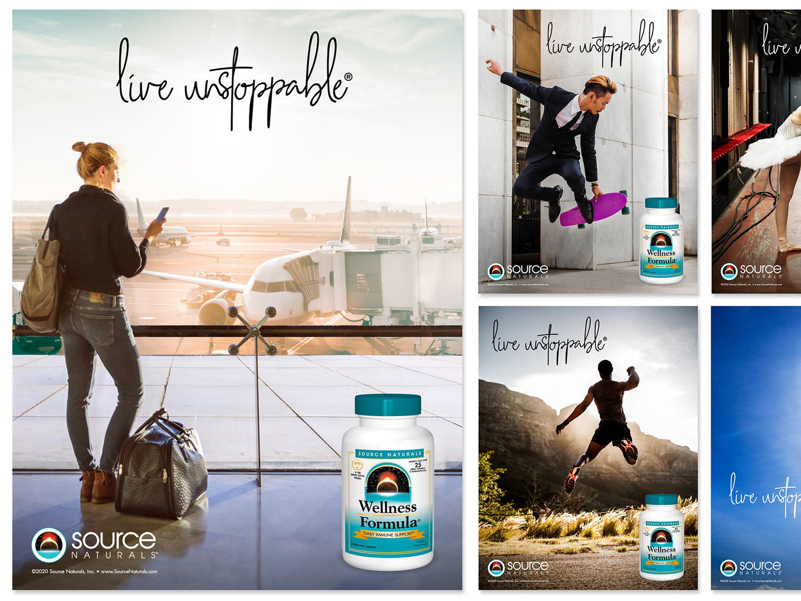
Part of Source Naturals' evolution was to develop a new outreach and revenue arm that spoke directly to consumers. For 40 years, the brand did some consumer outreach, but never sold its product directly to the consumer (only through retailers). SN's new website took all the work mentioned above to create a new platform for consumers to shop, view/submit reviews, read blogs, and interact with Source Naturals directly through webinars and other outreach methods.
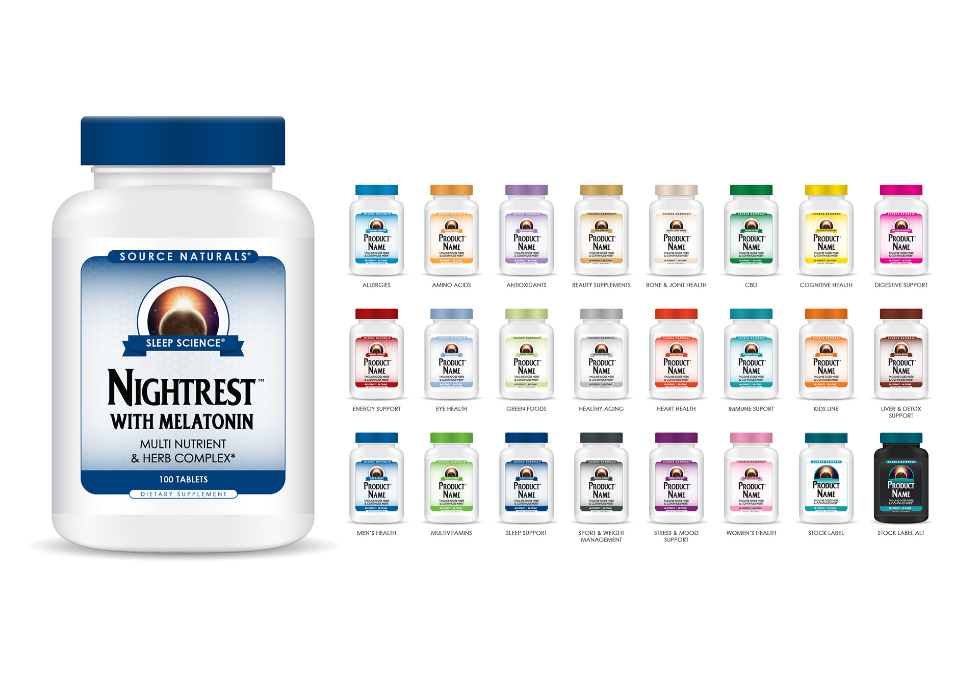
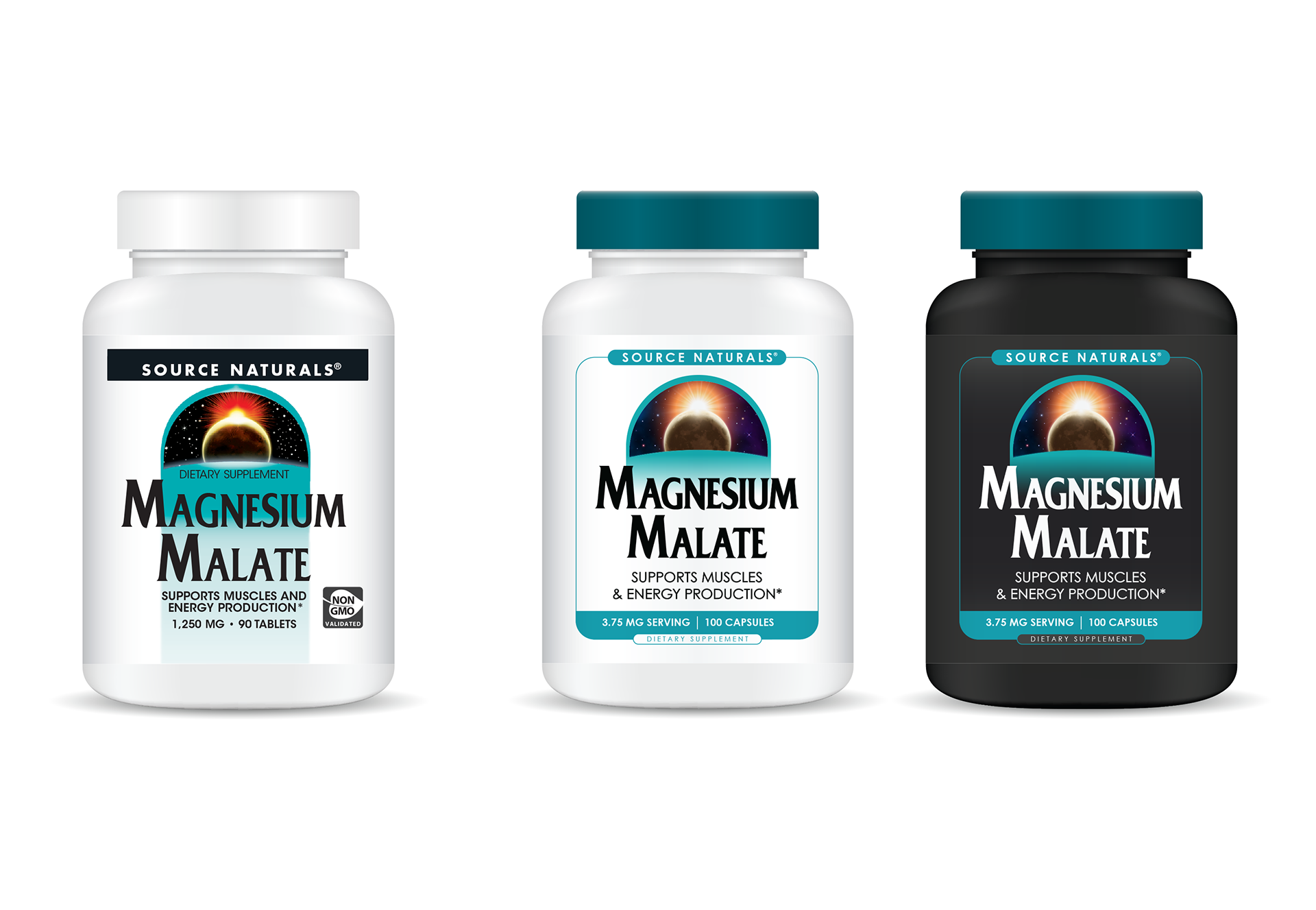
One of the existing challenges of a 40-year brand that lacked brand guidelines was the cacophony of product labels generated over time. Source Naturals has an active SKU list of 2000 +/- products, separated into approximately 25 sub-lines and/or categories, all being created and updated at various points throughout the brand's history. Mark 1 approach consisted of taking the stock label look (products not within sub-lines) and making simple yet effective changes including: new syzygy, brand-based colors, framing, reduction of teal background fade for better readability, and cleaner and simplified hierarchy. The substrate is updated, moving to a matte gloss instead of high gloss (reduced glare for improved photography opportunities), with a slight sliver sheen to enhance the colors. The core font used on the product name remains the same for easier recognition and connection to past labels.
The sub-line expansion removes the various label confusion of past product sets, replacing it with a structured look and feel. A set hierarchy across all categories allows easier ability to find information on any label, with unique palettes assigned to each category (tied back to the expanded harmony wheel). This allows a customer to easily find the category they are looking for when exploring the shelf, narrowing in on their product of choice quickly and with less distraction. For international situations, a traveler could narrow their search to their product of choice with little assistance thanks to color, hierarchy, and familiar benefit icons, regardless of if the label is in a language they may not understand.
With a brand guide as a foundation, new logo, cohesive color palette, universal icons, and updated faces to its products, Source Naturals is now prepared to market to a younger audience while still retaining core callbacks and familiar presentations so as not to frighten or confuse its existing consumer persona.
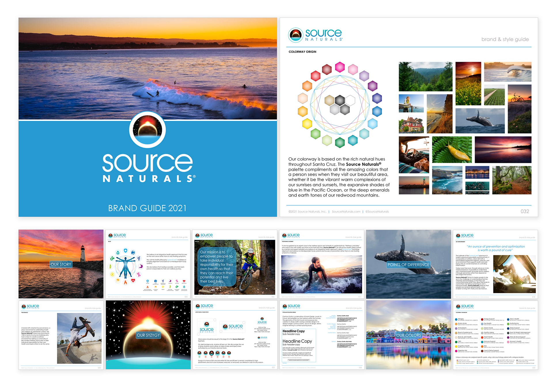
Source Naturals® 2021 Brand Guide
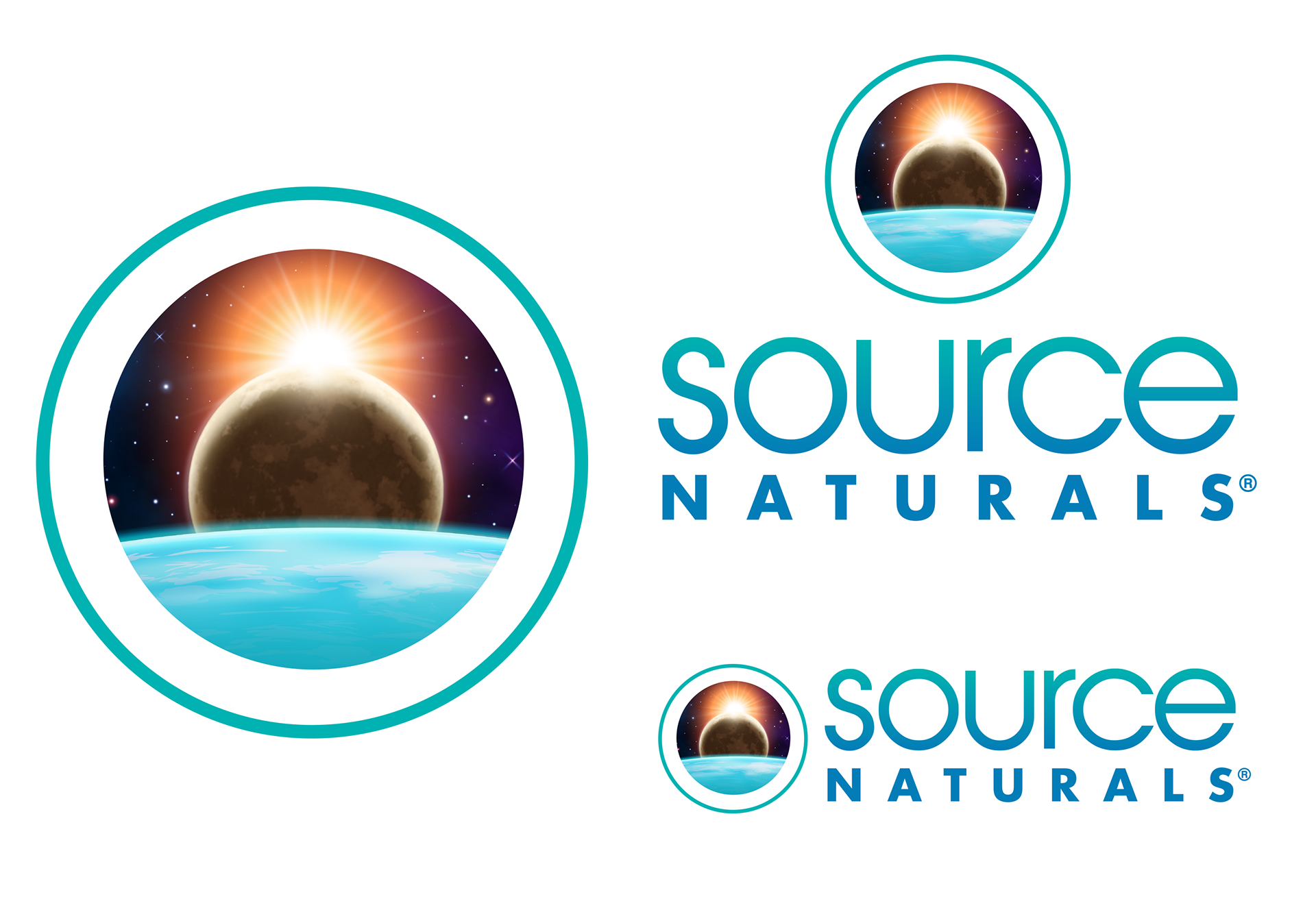
Source Naturals® Logo Evolution (for 40th anniversary)
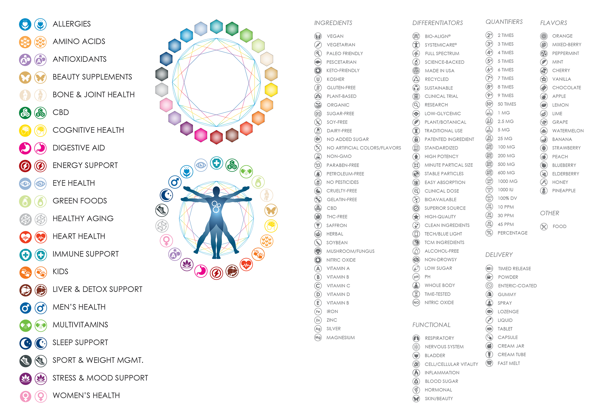
Source Naturals® Category Icons, Benefit Icons, and Harmony Wheel
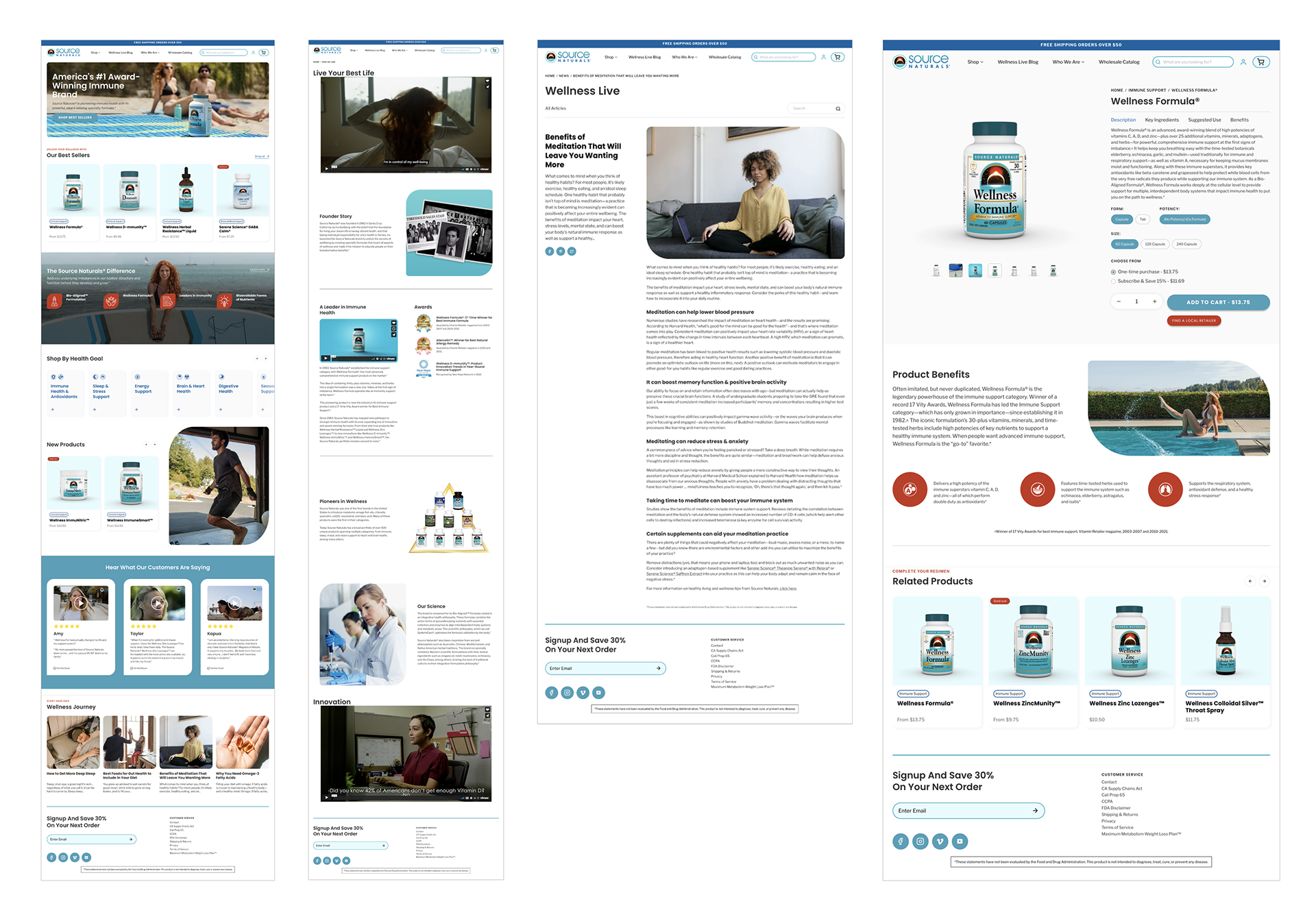
Source Naturals® Direct-to-Consumer Website
Source Naturals™ Label Evolution